• Gobliiins Collection - Switch Review

    In the early 90s, Coktel Vision (which later became Sierra On-Line) released a quirky point and click adventure game titled Gobliiins which had players bouncing between three different Goblins to find a cure for good King Angoulafre.

  • The Core - PC Preview

    Sometimes when you are browsing the internet for information on how to do something, you stumble upon ideas or projects or even games that people might be working on...

  • Cat Mail Co. - PC Review

    What a meow-gnificent evening it is to send your paw-rcels out to those family and friends! Are mew looking to pick up an item or send something out? Well at Cat Mail Co. we can send and receive all your deliveries!

  • Volontes - Nintendo Switch Review

    Have you ever grown up feeling like you don't belong? For our Heroine, that's the feeling she lives with everyday in her small farming village. But it's not her only secret...

  • STARSEEKER: Astroneer Expeditions - PC Preview

    STARSEEKER: Astroneer Expeditions is just that! Massively co-operative and not an MMO! When you first run the game you are instantly into the tutorial...

  • Dread Delusion - Xbox Series X|S Review

    Today we’re looking at what has rapidly become an absolute favorite in the open-world RPG genre for me. An interesting story, memorable NPCs, stunning visuals, and a setting absolutely dripping with flavor, Dread Delusion sets its tone immediately and sticks with it.

  • House Flipper Remastered Collection - PC Review

    I enjoy simulation-type games, and I enjoyed the original release of House Flipper, but I never got around to getting the DLC. When the remastered version of the game was released, I figured it would be the best way to experience the DLC while checking out how the base game was upgraded.

  • GranBlue Fantasy: ReLink Endless Ragnarok - PS5 Review

    GranBlue Fantasy: ReLink released in 2024 bringing the GranBlue universe to an action adventure JRPG format. With a party of up to four members, this band of skyfarers set out for new skies, adventures, and dangers. Two years later, Endless Ragnarok...

  • 70s-Style Robot Anime Geppy-X - PS5 Review

    70s-Style Robot Anime Geppy-X is a mouthful of a title, but you know what? It’s quite the challenging game to describe as well. At its core, 70s-Style Robot Anime Geppy-X is a shooter...

Showing posts with label Top Video Game Logos. Show all posts

Top Video Game Logos Part 5


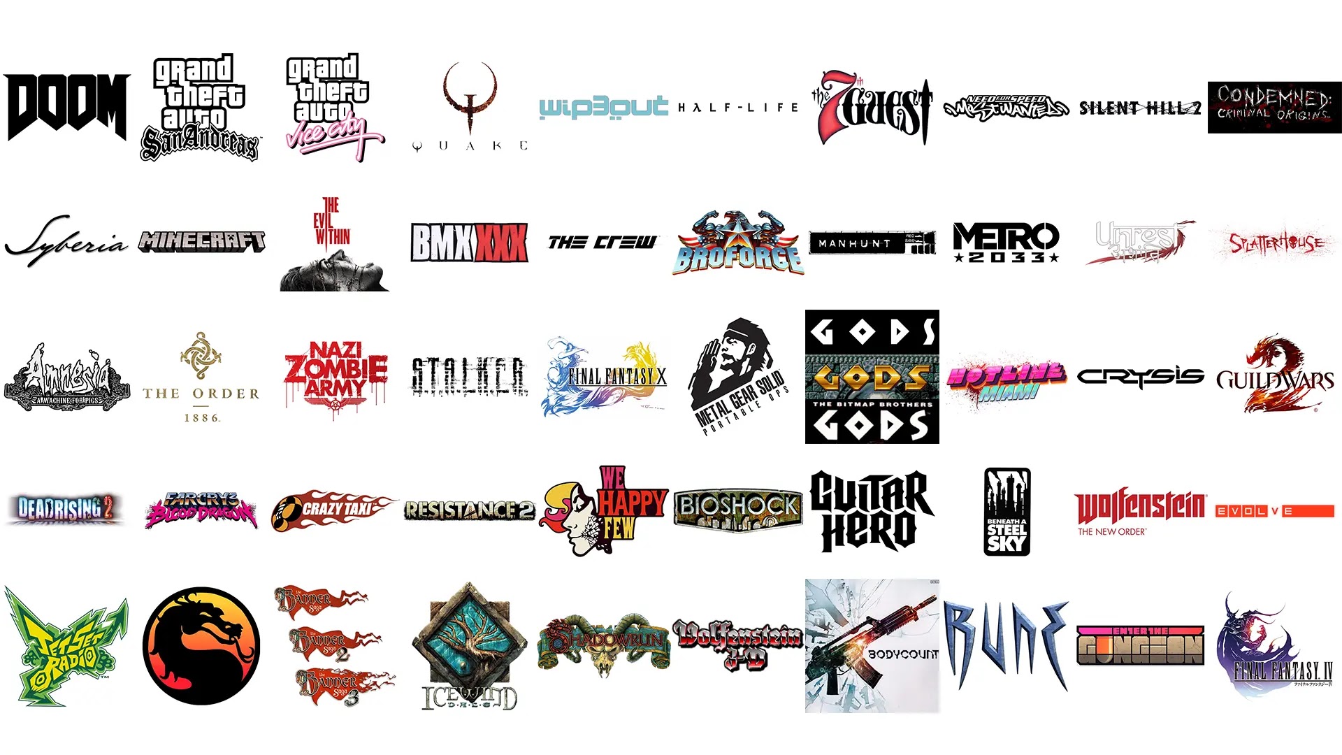
Continuing on with Part 5 of our Top video game logos Gaming Thoughts series, here are the last ten entries from Hamza for now right after a short re-introduction of what this list contains.

Estimated reading time: 6 minutes


One thing I believe I should clear before commencing: the title of this list is very vague. Now, a logo by definition is a graphic icon used to identify something, anything, whatever. It is usually the first visual identity you notice of a brand, business, or organization, and the basic types range from symbol, word mark, letter mark, emblem, or any interesting combination of the four.


For the sake of removing a layer of stress from my mind, I decided to take all logo types into account - so expect iconic typography, abstract symbols, aesthetically pleasing pictograms, and the like. This list covers only the logos that represent either a single video game or an entire franchise at large (ex: Grand Theft Auto and Final Fantasy), though there's no "one-game-per-franchise" rule here. Often long running franchises implement tweaks here and there to accommodate with the times and as such, variations have also been taken into account.


So without further ado, here's the next part of the list:

41. Jet Set Radio


Both this game and its sequel, Jet Set Radio Future, have strong graphic design. The first one is rooted in the graffiti punk aesthetic; while the sequel embraces a minimal Y2K-inspired identity.


I specifically love the first because of how full of energy and stylish it is. In the game you traverse through Tokyo on skates, tagging on walls; and the logo fully encompasses the idiosyncratic activities rather well.

42. Mortal Kombat


Dragons are never not cool… and this logo proves just that! Designed by Ed Boon, the series’ creator, the symbol is inspired by the yin-yang symbol and features a stylized Dragon that’s meant to represent the Elder Gods.

43. The Banner Saga

Featuring a wonderfully decorated initial and a banner that you can just feel waving majestically in the wind, this logo is at once an invitation to grand storytelling. I love it when static designs immediately spark animated visuals in your head.

44. Icewind Dale

Black Isle Studios - the game’s developer - had a pretty solid eye for design (the company itself has a solid logo and gets a mention in the next list). Almost every game developed or published by them carry iconic and memorable covers and typography; and from them all Icewind Dale is my all-time favorite. Featuring a stylized illustration of the Great Oak, there’s decades worth of story and ancient lore behind this logo.

45. Shadowrun


This one is a tattoo first and game logo second. Intricate and intimidating, the interesting combination of elements make it work as a prelude to anything: it could be the logo to a bar, a biker gang, or even a criminal syndicate.

46. Wolfenstein 3D

I don't know why, but for some reason there's something darkly anachronistic about it; I mean, after all the Third Reich never got to survive to the 80's. So seeing a typeface reminiscent of Fraktur infused with the typical two-tone gradient style of the so-called greatest decade is strangely comical.


Given the later installments' penchant to provide an alternate reality where the Nazi power won WWII, this logo in hindsight seems to unwittingly adumbrate as to where the franchise would ultimately head.

47. Bodycount

The spiritual successor to Criterion's Black - which has one of my all time favorite covers - both the cover and typography of Bodycount are fantastic. Both games worship arms and ammunition, and that ideology is reflected on the minimalist and striking covers.


The chopped and geometric typography is definitely an improvement over Black.

48. RUNE


RUNE is a very visually impressive game - and it still holds up to this day. The stone-carved and angular logo takes its cues from the runic alphabet; fitting as the game is based on the Norse Mythology.

49. Enter the Gungeon


The pun is genius and the logo is equally just as good. Designed by Cory Schmitz (who also designed the wonderful logo for Everybody’s Gone to the Rapture, among others), I love the color palette and composition of the elements. I also love the bullet substituting the U in Gungeon.

50. Final Fantasy IV

Unlike the previous entry which feels gracefully elegant, this one is dramatically Shakespearean and aggressive. Having next to no knowledge about this game, I can only surmise the character is supposed to be the ultimate baddie? Whatever the case may be, the moody color palette and dramatic posture makes it easily the second best FF illustration out there.

Thank you for checking out our latest Top Video Game Logos series and we hope to be back with more next year!


Share:

Top Video Game Logos Part 4


Continuing on with Part 4 of our Top video game logos Gaming Thoughts series, here are the next ten entries from Hamza right after a short re-introduction of what this list contains.

Estimated reading time: 8 minutes


One thing I believe I should clear before commencing: the title of this list is very vague. Now, a logo by definition is a graphic icon used to identify something, anything, whatever. It is usually the first visual identity you notice of a brand, business, or organization, and the basic types range from symbol, word mark, letter mark, emblem, or any interesting combination of the four.


For the sake of removing a layer of stress from my mind, I decided to take all logo types into account - so expect iconic typography, abstract symbols, aesthetically pleasing pictograms, and the like. This list covers only the logos that represent either a single video game or an entire franchise at large (ex: Grand Theft Auto and Final Fantasy), though there's no "one-game-per-franchise" rule here. Often long running franchises implement tweaks here and there to accommodate with the times and as such, variations have also been taken into account.


So without further ado, here's the next part of the list:

31. Dead Rising 2

Very few logos include scanlines in their logos.

Dead Rising 2 is one of those very few.


Being the ‘scanline’ junkie that I am, there’s something about this aesthetic that I adore. It’s also clever: media and the news play a major role in the game.


32. Far Cry 3: Blood Dragon

Designed by one of my all-time favorite visual artists, James White (of Signalnoise fame), the logo – and indeed, the entire cover – is a splendid pastiche of the neon-flavored side of the 80’s.’


No surprise, given the fact that the artist significantly helped popularize the essence of the synthwave scene; from which the game borrows and pays heavy tribute to.


For the Blood Dragon title, he used his custom font Neo-Noire.


Mr. White would also go on to create the identity for the spin-off game, Trials of the Blood Dragon. I highly recommend checking his website for all behind-the-scenes and alternate ideas sketches. They are wild!

33. Crazy Taxi


Instantly iconic.


You’ll be very hard-pressed to find someone who truly doesn’t know what game the crazy ‘C‘ belongs to. To put this in perspective: my dad, whose only contact with the video gaming world has been through a digital version of Sudoku, can easily name the game.


To be fair, he does refer to it as “that crazy driving game“, but hey it’s close.
Also: tribal flames. If there’s one thing I truly enjoy drawing on paper, it’s tribal flames. They’re just insanely fun and cathartic to draw.


34. Resistance 2


The Resistance series has had pretty solid graphic design in all instalments. The mutant skull with the landscape substituting for its teeth is a pretty iconic image for the series. The typography – which is the main focus here – has also been very solid from the get go.


Until the series was given a minimalist overhaul by Olly Moss, the game employed blocky letters that at-once feel militaristic, appropriate given the game’s theme.

35. We Happy Few

Maybe it’s because I’ve seen The Prisoner a hundred times, but the second I saw the We Happy Few logo (minus the mask graphic), I instantly knew this would be a 60’s inspired title set in some sort of a dystopian world.


I haven’t played the game yet, but my observation was rather spot on. That’s the mark – and indeed the overall point – of good graphic design.

36. Bioshock

This game’s logo looks just as cool animated as it does in static form. Even if you don’t know much about the game, the Art Deco font hints at something retro and the rusty, corroded nature implies water plays a huge role.


37. Guitar Hero

The typography borrows heavily from the metal logos of the 70’s and 80’s, namely Metallica, AC/DC, Iron Maiden, and Pentagram.


This entry is a particularly tricky one as I love both the original logo and the revamp by Pentagram (the OTHER one). The composition is clean and the exaggerated curves and tails of the letters give off a very energetic, kinetic look.


Pentagram took the existing template and, well, shaved off the extra flair to give it a slightly more inclusive look, to reflect the wide variety of music beyond just heavy metal – which to me works just as well.

38. Beneath a Steel Sky

I simply love everything about this game: the poetic title, fantastic artwork by Dave Gibbons (of Watchmen fame), catchy soundtrack… this awesome logo. Stark black and white, the typography seems to play out the game’s title while the factory silhouette alludes to the ‘steel sky’.


39. Wolfenstein: The New Order


The Wolfenstein series was the last place I expected to carry good graphic design – but boy do they pull it off nicely in The New Order. The marketing for the game contained strong use of red, white, and black, with extremely clean typefaces. The loading screens use a blackletter typeface while an ultra clean font is used to convey the current year in-game.


New Order uses an even more simplified version of the 2009 Wolfenstein logo (which itself was a simplified variant of Return to Castle Wolfenstein). The cleanness of the letters mean any combo of the aforementioned colors work brilliantly.

40. Evolve

At first glance, Evolve’s logo is simple and unassuming; but it’s rather clever in its simplicity. The game sees a group of 4 hunters up against a monster who continuously evolves. This should be enough to make you understand the design.


Check back next week for part 5!


Share:

Top Video Game Logos Part 3


Continuing on with Part 3 of our Top video game logos Gaming Thoughts series, here are the next ten entries from Hamza right after a short re-introduction of what this list contains.

Estimated reading time: 8 minutes


One thing I believe I should clear before commencing: the title of this list is very vague. Now, a logo by definition is a graphic icon used to identify something, anything, whatever. It is usually the first visual identity you notice of a brand, business, or organization, and the basic types range from symbol, word mark, letter mark, emblem, or any interesting combination of the four.

For the sake of removing a layer of stress from my mind, I decided to take all logo types into account - so expect iconic typography, abstract symbols, aesthetically pleasing pictograms, and the like. This list covers only the logos that represent either a single video game or an entire franchise at large (ex: Grand Theft Auto and Final Fantasy), though there's no "one-game-per-franchise" rule here. Often long running franchises implement tweaks here and there to accommodate with the times and as such, variations have also been taken into account.

So without further ado, here's the next part of the list:

21. Amnesia: A Machine for Pigs


Horror fonts by and large are an ugly, incoherent mess. Granted, they do make for killer logos of death metal bands and gory films – if used correctly, that is.

The Amnesia custom font is, frankly, rather ugly. It looks like a heavily distorted version of the god-awful Chiller font; you know the one we all used on our birthday cards in class 3.

Anyway, imagine my surprise when I saw the cover of A Machine for Pigs. I could not believe that something that was previously rather ugly was now… aesthetically eye-pleasing.

The primary focus is not on the title itself, but rather the intricate art surrounding it. A meticulous hodge podge inspired by the traditional art of wood carving, floral design, and machinery (natch!), this is one of my all time favorite video game logos.

22. The Order: 1886


Quite the controversial game when it came out, there are many aspects of The Order: 1886 which are good – namely the cinematic and gorgeous look of the game… and the logo of course.

The typeface is a no-nonsense serif; the uneven roughness giving it an artisanal, official look. The symbol at the top – a highly stylized ouroboros – serves as the insignia of the eponymous group.

The rusty gold gives it a time-appropriate, weathered finish.

23. Zombie Army Trilogy


Designed by the ever-amazing Luke Preece, the logo is fairly simple: blocky, sans-serif font dripping in blood. The subtle grunge texture and overall packaging help in setting the B-movie, vintage horror vibe perfectly.

24. S.T.A.L.K.E.R.


The game’s logo is a prime example of confident graphic design.

Normally when you’re working on a new IP, you have to make sure the logo is readable and clear.

S.T.A.L.K.E.R., though while using simple enough lettering, eschews that rule and applies a grunge, corroded texture all over it – rendering it barely readable from a certain distance (becoming progressively more unreadable on the covers of the sequels) but making it stay true to the game’s rusty post-apocalyptic setting.

25. Final Fantasy X


The Japanese versions of Final Fantasy covers have traditionally been classy and beautiful.
Employing a stark white background, the focus has always been on the serif typeface (Runic MT Condensed, if you were wondering) and the majestical illustrations of Yoshitaka Amano.

Keeping in mind not to inundate the list with too many examples of one franchise, for this entry I had to choose between FFVIII and FFX – but the latter’s hopelessly lovely, flowing illustration won out in the end.

26. MGS Portable Ops


Hideo Kojima has a very strong eye for graphic design; or he’s at the very least good at employing those who do.

Since the franchise is primarily centered around a myriad of militaristic organizations and factions, it’s only logical the series should employ heavy use of solid graphic design – both in-game and on packaging.

The logo for MGS Portable Ops, to me, is the best from this long-running series. The top half contains a stylized illustration of Big Boss in mid-salute, with the bottom text slanted to match the perspective of the artwork.

27. GODS


The typography is wonderfully geometric and minimalist.

While searching online to refresh my memory for this article, I discovered there seem to be quite a few versions of the logo – all not knowing exactly what to do with the letter ‘S‘.

It’s understandable; the perfectly symmetrical ‘O‘ was clearly the first letter to be designed, which is sliced in half to form ‘D‘, which is then further chopped to make ‘G‘.

The ‘S‘ is the outlier, but the tall and curvy variant on the Amiga cover perfectly balances and complements the rest of the logo.

I’m not sure why the ‘S‘ in particular appears different on the main menu, and I certainly do not like the treatment of that letter on the Mega Drive cover. It looks terribly out-of-place.

28. Hotline Miami


Hotline Miami came out at a very unique time and managed to capitalize greatly on a then-nascent but hotly trending topic of the day: synthwave.

A perfect screenshot of the retrowave aesthetic, for most people (myself included) this is ground zero of their obsession with the more vibrant identity of the 80’s.

29. Crysis


This right here is a strong example of a powerful logo.

Often in the world of graphic designing you will hear clients say “we need a powerful logo”. Regardless of the nature of the business, this is more or less what they’re really thinking about.

Other great examples include Oracle, Gillette, and the modern Electronic Arts logo.

Dynamic, razor-sharp, and reeking of hard-hitting sci-fi, the Crysis logo is stuff of dreams – a perfect icon for the legendary status of the game amongst us gamers.

On an interesting note, the logo itself appears to be an offshoot (and a better one at that) of the company behind the game, Crytek.

Next time you hear the word “powerful”, you know where to begin.

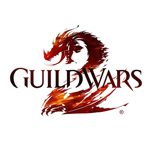
30. Guild Wars 2


This game’s logo is like an aggressive version of the Final Fantasy logos.

Eschewing the typical medieval-esque lettering from the previous game, the sequel incorporates a chopped-up serif typeface. The main highlight, of course, is the highly stylized dragon that forms the letter ‘2’.
Bonus points for cleverly making the transition between the critter and the number seamless.

Check back next week for part 4!


Share:

Top Video Game Logos Part 2

Continuing on with Part 2 of our Top video game logos Gaming Thoughts series, here are the next ten entries from Hamza right after a short re-introduction of what this list contains.

Estimated reading time: 8 minutes


One thing I believe I should clear before commencing: the title of this list is very vague. Now, a logo by definition is a graphic icon used to identify something, anything, whatever. It is usually the first visual identity you notice of a brand, business, or organization, and the basic types range from symbol, word mark, letter mark, emblem, or any interesting combination of the four.

For the sake of removing a layer of stress from my mind, I decided to take all logo types into account - so expect iconic typography, abstract symbols, aesthetically pleasing pictograms, and the like. This list covers only the logos that represent either a single video game or an entire franchise at large (ex: Grand Theft Auto and Final Fantasy), though there's no "one-game-per-franchise" rule here. Often long running franchises implement tweaks here and there to accommodate with the times and as such, variations have also been taken into account.

So without further ado, here's the next part of the list:

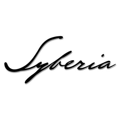
11. Syberia


The logo employs a crisp slanted cursive typography. It feels personal, like a hand-written note from a diary. Some versions of the logo also include the signature, B. Sokal, at the bottom (referring to the creator of the series, Benoit Sokal).

I find this highly interesting, as the primary objective of the first game revolves around hunting down an elusive heir to an automaton company for his signature. Along the way several aspects of Kate Walker‘s personal life interject her journey, making her grow and mature as a person.

If there’s one logo that flawlessly captures the themes of the game, it has to be this one.

12. Minecraft


I love it when logos mirror the visual aesthetic of the game (see Unrest).

Minecraft is no exception: the logo is a minimal take on the blocky visuals of the game, even sneakily adding a Creeper in there.

The 3D perspective hints at there being more to the game than just surface-level exploration.

13. The Evil Within


Sharp. Angular. Pointy. Lethal. You could seriously take out someone’s eye with this. In fact, on the cover it actually appears to be doing just that!

This logo reminds me of the logos of so-called ‘video nasty‘ flicks of the 70’s. Not surprising, really, seeing how the game borrows obvious influence from the more popular films from the genre, like Texas Chain Saw Massacre and Halloween.

Isolated from the cover or not, the logo is vintage horror.

14. BMX XXX


I literally got nothing to say about this one. It’s just the game’s title written in large, blocky letters. The subtle grunge texture helps.

Sometimes simplicity triumphs!

15. The Crew


As a graphic designer myself, I’ve always been fond of this particular style of the letter “E”.

When used correctly in the appropriate context, the so-called “geometric E” helps greatly in elevating the design to ‘cool’ status. Indeed, the entire typography is given the geometric treatment and then slanted forwards; reflecting the high-octane nature of the game.

The Crew: Wild Run features a brilliant orange brush typography for the subtitle. Despite my not having played any installment from the series yet, I at once got the impression that this game (expansion pack, to be precise) features off-road and eclectic line-up of vehicles.

Yup.

16. BroForce


The logo is so steeped in masculinity and satire, it’s vulgar.

An overt parody of the hyper-masculine action hero scene of the 80’s and early 90’s, the logo in particular – consisting of a muscle-bound eagle and typeface reminiscent of G.I. Joe (Hauser, if you’re interested… though for this one the best bet is ITC Machine Std) – is a comically perfect representation of the world seen through an American lens.

It is dipped in the flavor of shameless and I love it.

17. Manhunt


If you grew up any time before the 2000’s, you’d instantly recognize what the logo is.

For those of you who don’t, it’s the game title written on top of a tape recorder. Manhunt‘s unique style is reminiscent of the VHS aesthetic and harkens back to the good ol’ days of ‘video nasties‘ of the 70’s and 80’s.
In fact, one of the more infamous characters from the Manhunt universe, Piggsy, is seemingly inspired by a character from the 1980 movie, Motel Hell.

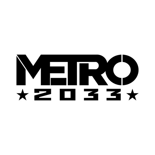
18. Metro 2033


Metro 2033 is a post-apocalyptic experience in which you traverse the vast and complex inter-connected Moscow Metro.

The beautiful, bold ‘Metro’ typography reflects this: each letter blends into each other, thus connecting, fittingly, like a metro. The ‘2033‘ harkens to the spartan, brutalist constructivism design movement which originated in Russia; leaving no room for doubt as to where the game is set.

19. Unrest


Unrest is a gorgeous-looking RPG made by an Indian company that takes place in Ancient India. It is only natural that the logo should reflect the theme.

Though written in English, the title borrows the unique style from the Sanskrit language and even includes a native translation below it. The flowing robe behind the text is a nice touch to the royal, ancient feel of the logo.

20. Splatterhouse


The logos of the first 3 Splatterhouse games are bloody awesome… literally.

Every letter is made up of thick dripping blood, giving off that quintessential horror look.

The 2010 reboot takes this aesthetic to the extreme and exaggerates the blood splatter. Even the typography is given a facelift: gone is the comic style lettering; replaced with violent, razor sharp letters that feel as though angrily slashed.

I’m also a fan of when designers replace certain letters of the logo with an element pertaining to the context, without losing readability: in this case, the iconic Terror Mask (or Hell Mask) substitutes the letter ‘O’.

Check back next week for part 3 of Top Video Game Logos!
 

Share:

Top Video Game Logos Part 1

Top video game logos, Gaming Thoughts series written by Hamza.

Estimated reading time: 6 minutes


Before getting into the author's introduction, we want to thank Hamza for all of the amazing work and contributions to Chalgyr's Game Room over the years. From Memorable Music to the Level Up series, their keen sense of art has always been a pleasure to read and share with others.


So let's begin shall we?

Here at CGR if there's one thing we love more than reviewing the latest (and the odd yesteryear classic) video game is making lists. Besides the annual "greatest of" lists that is mandatory from any worthy gaming website, we also love isolating certain aspects of video games and offering our thoughts on it. So far we've talked about both the beautiful and the bad of video game covers; memorable music in gaming; nostalgic, personal memories of what makes video gaming memorable to each of us; and even offered analysis on particular levels and chapters. Some of these are an ongoing series, so be sure to check back every so often for updates.

Continuing on with the tradition of attempting to make quite-unprecedented lists, the author decided to take on a rather ambitious task: Top 100 Logos in the Gaming World, with the list being split into sets of 10 containing both video game and video game company logos. Because this list reflects the views of this particular individual, it would be foolish to expect nothing else but nods of approval; we at CGR understand the necessity of criticism and we welcome it.

One more thing I believe I should clear before commencing: the title of this list is very vague. Now, a logo by definition is a graphic icon used to identify something, anything, whatever. It is usually the first visual identity you notice of a brand, business, or organization, and the basic types range from symbol, word mark, letter mark, emblem, or any interesting combination of the four.

For the sake of removing a layer of stress from my mind, I decided to take all logo types into account - so expect iconic typography, abstract symbols, aesthetically pleasing pictograms, and the like. This list covers only the logos that represent either a single video game or an entire franchise at large (ex: Grand Theft Auto and Final Fantasy), though there's no "one-game-per-franchise" rule here. Often long running franchises implement tweaks here and there to accommodate with the times and as such, variations have also been taken into account.

So without further ado, here's the list:

1. DOOM

Designed by Don Ivan Punchatz, the DOOM logo is to video games what IBM is to technology. I believe this is the single most recognizable logo in the world of gaming, and one of the very few that works just as well minimally (as seen in 2016 DOOM) as it does in its more iconic ‘metal hell’ form seen in the original two games.

Even the more militarized ‘remix’ as seen in DOOM3 and BFG Edition only proves that anything works with the logo.

2. GTA San Andreas


The Grand Theft Auto typography is beyond iconic: it has taken a life all of its own, with an innumerable number of parodies and tributes existing all over the Internet.

‘Grand Theft Auto‘ is the proper brand name of the entire series, and in a long-running franchise such as this it is only natural it should remain consistent. It is the subtitle that’s constantly reworked with distinct styles to reflect the nature of the installment.

For San Andreas they went with an Old English font – something very popular among street gang logos and tattoos, something this game prominently features front and center (for more info, check out gangs like Crips and Bloods).

If you’re curious, The Grand Theft Auto font is called Price Down Black, and the subtitle’s typeface is called Cloister Black.

3. GTA Vice City


Because nothing says the 80's more than hot pink and cursive font.’

No really, I’m serious. Nothing does. Well, except maybe a few palm trees… Lambo Countach… Ferrari Testarossa… cool cyan… sunglasses.

If the words “Miami” and “Vice” did not enter your head by the end of the previous sentence, kindly donate your entire supply of oxygen to someone else.

4. Quake


Designed by Sasha Shor, Quake’s logo is instantly iconic – and consistent with the rest of id Software’s repertoire.

The typography is fully custom and the rusty, stylized Q confidently serves as the game’s box art. It has been remixed over the years for the sequels and now stands as the series’ representative.

I find it interesting that a nail should be used as the Q’s ‘tail’ – given how Nine Inch Nails worked on the fantastic sound design for the first game.

5. WipeOut 3


The graphic design of the first three Wipeout games are second to none – and they should be, for they were designed by the legendary The Designers Republic (TDR).

Never had any game before employed such extensive, important use of graphic design – and very few games have ever since.

The original logo in particular stands out because it showcases the cleverness of TDR: the typography consists of chopped up versions of the number 8. Why 8? Because that number appears by default on stopwatches and timers.

(Note: this was initially brought to my attention by Froyo Tam via her Tumblr account)

6. Half-Life


Using a simple sans-serif font (Trebuchet MS) and substituting the “a” in “Half” with the lambda symbol (?), what I like about the logo is the wide tracking between letters; conveying a sense of professionalism and seriousness.

Interesting thing to note here is that the lambda symbol strongly resembles a hand clutching a crowbar.
So not only does the symbol lend its mathematical and scientific connection to the game (referring to the Lambda Complex and the sci-fi nature of the game), but also an abstractly visual one, too (Gordon Freeman and his iconic crowbar).

7. The 7th Guest


Dignified. Imposing. Royal as an intricately decorated wrought iron gate leading to a gothic mansion.

But also a bit of a show-off, like a playful twinkle-eyed showman eager to show you his next presentation.

8. NFS Most Wanted - 2005


The original Most Wanted‘s typography is good stuff; the kind of stuff that turns ordinary people into artists.

The number of times I’ve sketched that logo on my school desks is between me and the cleaning lady who had to wipe it off every other day.

Right off the bat the message is clear: this game is heavily inspired by graffiti culture and will include an eclectic mix of thrashin’ tunes that range from gnarly hip-hop to industrial metal.

Very accurate, to say the least. I wish more NFS games had creative typography like this one.

9. Silent Hill 2


Silent Hill typography has fundamentally employed uncomfortable amounts of kerning between the letters and uneven alignment. That is typical of any horror title.

While no two logos of this long-running franchise have ever been quite the same, I really love the treatment they gave to Silent Hill 2 (with Downpour a close second).

The intertwined, symbiotic nature of the letters give off a creepy, sickly vibe.

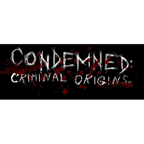
10. Condemned: Criminal Origins


Scratchy, clawed font? Check. Copious amount of blood splatter? Check.

There’s no doubt as to what Condemned: Criminal Origins is all about.

Reminiscent of an actual font called Anorexia, both this game and its sequel use a similar style for their titles. But why though? It’s because the logo is a perfect reflection of the feeling one gets during gameplay: overwhelming sense of insecurity, paranoia, and the general feeling of being trapped in a scary, dangerous place.

Check back next week for part 2!


Share:

Random posts

Our Streamers

Susan "Jagtress" N.


S.M. Carrière

Aldren


Affiliates

JenEricDesigns – Coffee that ships to the US and Canada

JenEricDesigns – Coffee that ships to the US and Canada
Light, Medium and Dark Roast Coffee available.

Blog Archive

Labels