


Continuing on with Part 2 of our Top video game logos Gaming Thoughts series, here are the next ten entries from Hamza right after a short re-introduction of what this list contains.
Estimated reading time: 8 minutes
One thing I believe I should clear before commencing: the title of this list is very vague. Now, a logo by definition is a graphic icon used to identify something, anything, whatever. It is usually the first visual identity you notice of a brand, business, or organization, and the basic types range from symbol, word mark, letter mark, emblem, or any interesting combination of the four.
For the sake of removing a layer of stress from my mind, I decided to take all logo types into account - so expect iconic typography, abstract symbols, aesthetically pleasing pictograms, and the like. This list covers only the logos that represent either a single video game or an entire franchise at large (ex: Grand Theft Auto and Final Fantasy), though there's no "one-game-per-franchise" rule here. Often long running franchises implement tweaks here and there to accommodate with the times and as such, variations have also been taken into account.
So without further ado, here's the next part of the list:
11. Syberia
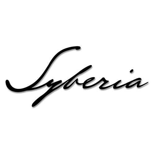
The logo employs a crisp slanted cursive typography. It feels personal, like a hand-written note from a diary. Some versions of the logo also include the signature, B. Sokal, at the bottom (referring to the creator of the series, Benoit Sokal).
I find this highly interesting, as the primary objective of the first game revolves around hunting down an elusive heir to an automaton company for his signature. Along the way several aspects of Kate Walker‘s personal life interject her journey, making her grow and mature as a person.
If there’s one logo that flawlessly captures the themes of the game, it has to be this one.
12. Minecraft

I love it when logos mirror the visual aesthetic of the game (see Unrest).
Minecraft is no exception: the logo is a minimal take on the blocky visuals of the game, even sneakily adding a Creeper in there.
The 3D perspective hints at there being more to the game than just surface-level exploration.
13. The Evil Within

Sharp. Angular. Pointy. Lethal. You could seriously take out someone’s eye with this. In fact, on the cover it actually appears to be doing just that!
This logo reminds me of the logos of so-called ‘video nasty‘ flicks of the 70’s. Not surprising, really, seeing how the game borrows obvious influence from the more popular films from the genre, like Texas Chain Saw Massacre and Halloween.
Isolated from the cover or not, the logo is vintage horror.
14. BMX XXX

I literally got nothing to say about this one. It’s just the game’s title written in large, blocky letters. The subtle grunge texture helps.
Sometimes simplicity triumphs!
15. The Crew


As a graphic designer myself, I’ve always been fond of this particular style of the letter “E”.
When used correctly in the appropriate context, the so-called “geometric E” helps greatly in elevating the design to ‘cool’ status. Indeed, the entire typography is given the geometric treatment and then slanted forwards; reflecting the high-octane nature of the game.
The Crew: Wild Run features a brilliant orange brush typography for the subtitle. Despite my not having played any installment from the series yet, I at once got the impression that this game (expansion pack, to be precise) features off-road and eclectic line-up of vehicles.
Yup.
16. BroForce

The logo is so steeped in masculinity and satire, it’s vulgar.
An overt parody of the hyper-masculine action hero scene of the 80’s and early 90’s, the logo in particular – consisting of a muscle-bound eagle and typeface reminiscent of G.I. Joe (Hauser, if you’re interested… though for this one the best bet is ITC Machine Std) – is a comically perfect representation of the world seen through an American lens.
It is dipped in the flavor of shameless and I love it.
17. Manhunt

If you grew up any time before the 2000’s, you’d instantly recognize what the logo is.
For those of you who don’t, it’s the game title written on top of a tape recorder. Manhunt‘s unique style is reminiscent of the VHS aesthetic and harkens back to the good ol’ days of ‘video nasties‘ of the 70’s and 80’s.
In fact, one of the more infamous characters from the Manhunt universe, Piggsy, is seemingly inspired by a character from the 1980 movie, Motel Hell.
18. Metro 2033
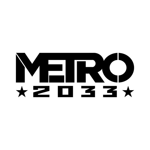
Metro 2033 is a post-apocalyptic experience in which you traverse the vast and complex inter-connected Moscow Metro.
The beautiful, bold ‘Metro’ typography reflects this: each letter blends into each other, thus connecting, fittingly, like a metro. The ‘2033‘ harkens to the spartan, brutalist constructivism design movement which originated in Russia; leaving no room for doubt as to where the game is set.
19. Unrest

Unrest is a gorgeous-looking RPG made by an Indian company that takes place in Ancient India. It is only natural that the logo should reflect the theme.
Though written in English, the title borrows the unique style from the Sanskrit language and even includes a native translation below it. The flowing robe behind the text is a nice touch to the royal, ancient feel of the logo.
20. Splatterhouse


The logos of the first 3 Splatterhouse games are bloody awesome… literally.
Every letter is made up of thick dripping blood, giving off that quintessential horror look.
The 2010 reboot takes this aesthetic to the extreme and exaggerates the blood splatter. Even the typography is given a facelift: gone is the comic style lettering; replaced with violent, razor sharp letters that feel as though angrily slashed.
I’m also a fan of when designers replace certain letters of the logo with an element pertaining to the context, without losing readability: in this case, the iconic Terror Mask (or Hell Mask) substitutes the letter ‘O’.
Check back next week for part 3 of Top Video Game Logos!


0 comments:
Post a Comment