


Top video game logos, Gaming Thoughts series written by Hamza.
Estimated reading time: 6 minutes
Before getting into the author's introduction, we want to thank Hamza for all of the amazing work and contributions to Chalgyr's Game Room over the years. From Memorable Music to the Level Up series, their keen sense of art has always been a pleasure to read and share with others.
So let's begin shall we?
Here at CGR if there's one thing we love more than reviewing the latest (and the odd yesteryear classic) video game is making lists. Besides the annual "greatest of" lists that is mandatory from any worthy gaming website, we also love isolating certain aspects of video games and offering our thoughts on it. So far we've talked about both the beautiful and the bad of video game covers; memorable music in gaming; nostalgic, personal memories of what makes video gaming memorable to each of us; and even offered analysis on particular levels and chapters. Some of these are an ongoing series, so be sure to check back every so often for updates.
Continuing on with the tradition of attempting to make quite-unprecedented lists, the author decided to take on a rather ambitious task: Top 100 Logos in the Gaming World, with the list being split into sets of 10 containing both video game and video game company logos. Because this list reflects the views of this particular individual, it would be foolish to expect nothing else but nods of approval; we at CGR understand the necessity of criticism and we welcome it.
One more thing I believe I should clear before commencing: the title of this list is very vague. Now, a logo by definition is a graphic icon used to identify something, anything, whatever. It is usually the first visual identity you notice of a brand, business, or organization, and the basic types range from symbol, word mark, letter mark, emblem, or any interesting combination of the four.
For the sake of removing a layer of stress from my mind, I decided to take all logo types into account - so expect iconic typography, abstract symbols, aesthetically pleasing pictograms, and the like. This list covers only the logos that represent either a single video game or an entire franchise at large (ex: Grand Theft Auto and Final Fantasy), though there's no "one-game-per-franchise" rule here. Often long running franchises implement tweaks here and there to accommodate with the times and as such, variations have also been taken into account.
So without further ado, here's the list:
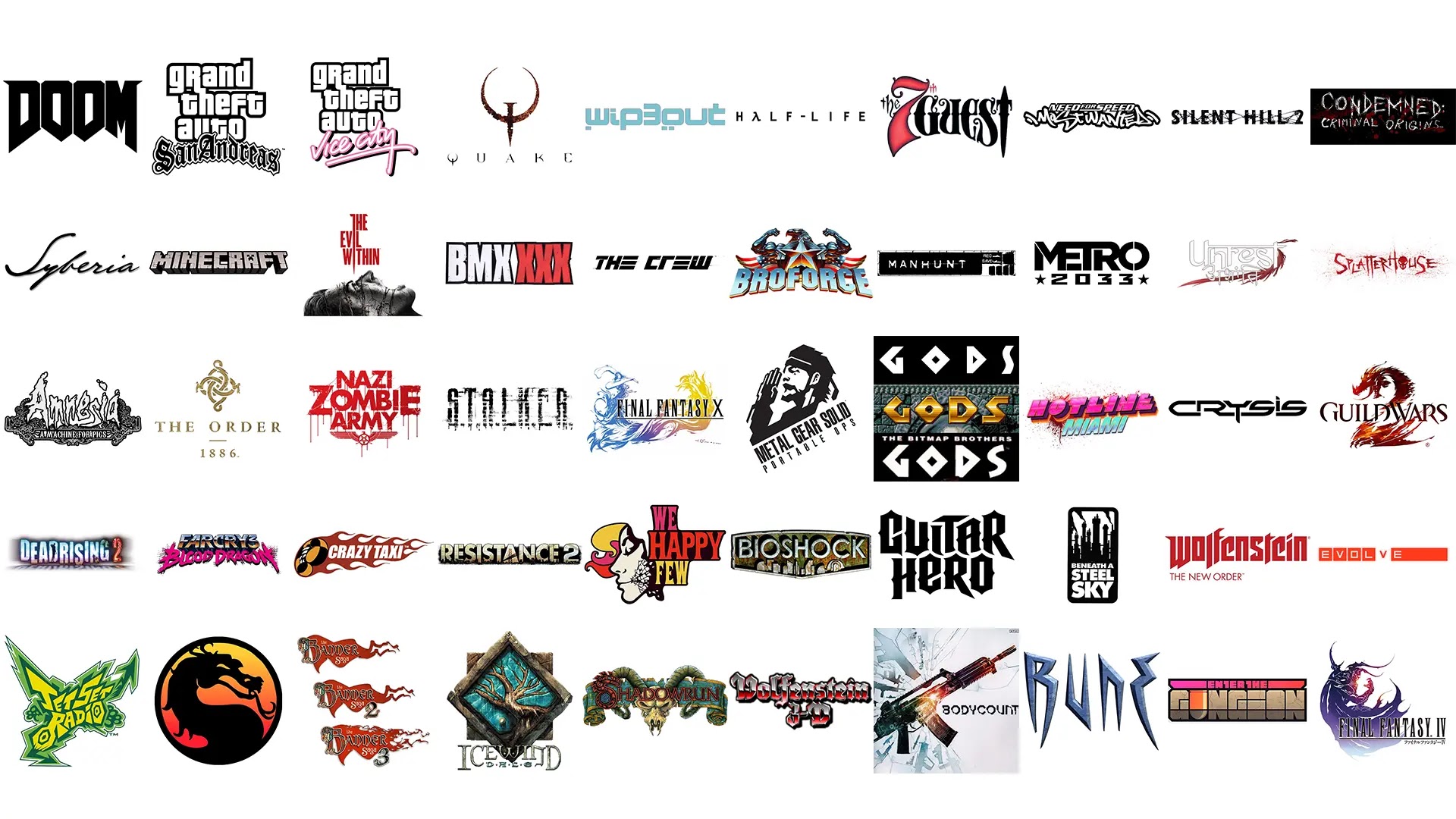
1. DOOM
 |
 |
 |
Even the more militarized ‘remix’ as seen in DOOM3 and BFG Edition only proves that anything works with the logo.
2. GTA San Andreas

The Grand Theft Auto typography is beyond iconic: it has taken a life all of its own, with an innumerable number of parodies and tributes existing all over the Internet.
‘Grand Theft Auto‘ is the proper brand name of the entire series, and in a long-running franchise such as this it is only natural it should remain consistent. It is the subtitle that’s constantly reworked with distinct styles to reflect the nature of the installment.
For San Andreas they went with an Old English font – something very popular among street gang logos and tattoos, something this game prominently features front and center (for more info, check out gangs like Crips and Bloods).
If you’re curious, The Grand Theft Auto font is called Price Down Black, and the subtitle’s typeface is called Cloister Black.
3. GTA Vice City

Because nothing says the 80's more than hot pink and cursive font.’
No really, I’m serious. Nothing does. Well, except maybe a few palm trees… Lambo Countach… Ferrari Testarossa… cool cyan… sunglasses.
If the words “Miami” and “Vice” did not enter your head by the end of the previous sentence, kindly donate your entire supply of oxygen to someone else.
4. Quake

Designed by Sasha Shor, Quake’s logo is instantly iconic – and consistent with the rest of id Software’s repertoire.
The typography is fully custom and the rusty, stylized Q confidently serves as the game’s box art. It has been remixed over the years for the sequels and now stands as the series’ representative.
I find it interesting that a nail should be used as the Q’s ‘tail’ – given how Nine Inch Nails worked on the fantastic sound design for the first game.
5. WipeOut 3

The graphic design of the first three Wipeout games are second to none – and they should be, for they were designed by the legendary The Designers Republic (TDR).
Never had any game before employed such extensive, important use of graphic design – and very few games have ever since.
The original logo in particular stands out because it showcases the cleverness of TDR: the typography consists of chopped up versions of the number 8. Why 8? Because that number appears by default on stopwatches and timers.
(Note: this was initially brought to my attention by Froyo Tam via her Tumblr account)
6. Half-Life

Using a simple sans-serif font (Trebuchet MS) and substituting the “a” in “Half” with the lambda symbol (?), what I like about the logo is the wide tracking between letters; conveying a sense of professionalism and seriousness.
Interesting thing to note here is that the lambda symbol strongly resembles a hand clutching a crowbar.
So not only does the symbol lend its mathematical and scientific connection to the game (referring to the Lambda Complex and the sci-fi nature of the game), but also an abstractly visual one, too (Gordon Freeman and his iconic crowbar).
7. The 7th Guest

Dignified. Imposing. Royal as an intricately decorated wrought iron gate leading to a gothic mansion.
But also a bit of a show-off, like a playful twinkle-eyed showman eager to show you his next presentation.
8. NFS Most Wanted - 2005

The original Most Wanted‘s typography is good stuff; the kind of stuff that turns ordinary people into artists.
The number of times I’ve sketched that logo on my school desks is between me and the cleaning lady who had to wipe it off every other day.
Right off the bat the message is clear: this game is heavily inspired by graffiti culture and will include an eclectic mix of thrashin’ tunes that range from gnarly hip-hop to industrial metal.
Very accurate, to say the least. I wish more NFS games had creative typography like this one.
9. Silent Hill 2

Silent Hill typography has fundamentally employed uncomfortable amounts of kerning between the letters and uneven alignment. That is typical of any horror title.
While no two logos of this long-running franchise have ever been quite the same, I really love the treatment they gave to Silent Hill 2 (with Downpour a close second).
The intertwined, symbiotic nature of the letters give off a creepy, sickly vibe.
10. Condemned: Criminal Origins
Scratchy, clawed font? Check. Copious amount of blood splatter? Check.
There’s no doubt as to what Condemned: Criminal Origins is all about.
Reminiscent of an actual font called Anorexia, both this game and its sequel use a similar style for their titles. But why though? It’s because the logo is a perfect reflection of the feeling one gets during gameplay: overwhelming sense of insecurity, paranoia, and the general feeling of being trapped in a scary, dangerous place.
Check back next week for part 2!


0 comments:
Post a Comment