


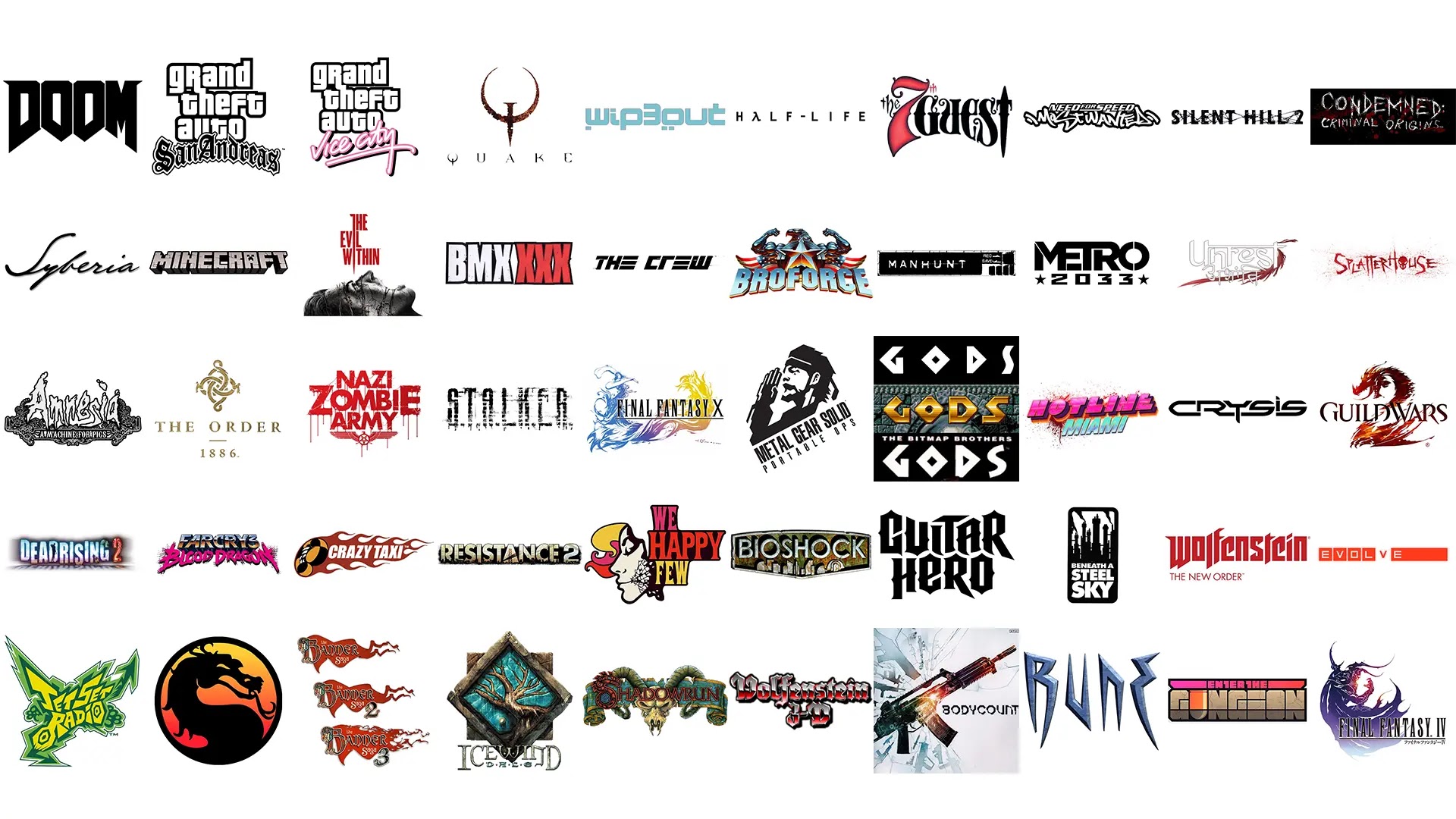
Continuing on with Part 5 of our Top video game logos Gaming Thoughts series, here are the last ten entries from Hamza for now right after a short re-introduction of what this list contains.
Estimated reading time: 6 minutes
One thing I believe I should clear before commencing: the title of this list is very vague. Now, a logo by definition is a graphic icon used to identify something, anything, whatever. It is usually the first visual identity you notice of a brand, business, or organization, and the basic types range from symbol, word mark, letter mark, emblem, or any interesting combination of the four.
For the sake of removing a layer of stress from my mind, I decided to take all logo types into account - so expect iconic typography, abstract symbols, aesthetically pleasing pictograms, and the like. This list covers only the logos that represent either a single video game or an entire franchise at large (ex: Grand Theft Auto and Final Fantasy), though there's no "one-game-per-franchise" rule here. Often long running franchises implement tweaks here and there to accommodate with the times and as such, variations have also been taken into account.
So without further ado, here's the next part of the list:
41. Jet Set Radio

Both this game and its sequel, Jet Set Radio Future, have strong graphic design. The first one is rooted in the graffiti punk aesthetic; while the sequel embraces a minimal Y2K-inspired identity.
I specifically love the first because of how full of energy and stylish it is. In the game you traverse through Tokyo on skates, tagging on walls; and the logo fully encompasses the idiosyncratic activities rather well.
42. Mortal Kombat

Dragons are never not cool… and this logo proves just that! Designed by Ed Boon, the series’ creator, the symbol is inspired by the yin-yang symbol and features a stylized Dragon that’s meant to represent the Elder Gods.
43. The Banner Saga

Featuring a wonderfully decorated initial and a banner that you can just feel waving majestically in the wind, this logo is at once an invitation to grand storytelling. I love it when static designs immediately spark animated visuals in your head.
44. Icewind Dale

Black Isle Studios - the game’s developer - had a pretty solid eye for design (the company itself has a solid logo and gets a mention in the next list). Almost every game developed or published by them carry iconic and memorable covers and typography; and from them all Icewind Dale is my all-time favorite. Featuring a stylized illustration of the Great Oak, there’s decades worth of story and ancient lore behind this logo.
45. Shadowrun

This one is a tattoo first and game logo second. Intricate and intimidating, the interesting combination of elements make it work as a prelude to anything: it could be the logo to a bar, a biker gang, or even a criminal syndicate.
46. Wolfenstein 3D

Given the later installments' penchant to provide an alternate reality where the Nazi power won WWII, this logo in hindsight seems to unwittingly adumbrate as to where the franchise would ultimately head.
47. Bodycount

The spiritual successor to Criterion's Black - which has one of my all time favorite covers - both the cover and typography of Bodycount are fantastic. Both games worship arms and ammunition, and that ideology is reflected on the minimalist and striking covers.
The chopped and geometric typography is definitely an improvement over Black.
48. RUNE

RUNE is a very visually impressive game - and it still holds up to this day. The stone-carved and angular logo takes its cues from the runic alphabet; fitting as the game is based on the Norse Mythology.
49. Enter the Gungeon
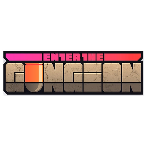
The pun is genius and the logo is equally just as good. Designed by Cory Schmitz (who also designed the wonderful logo for Everybody’s Gone to the Rapture, among others), I love the color palette and composition of the elements. I also love the bullet substituting the U in Gungeon.
50. Final Fantasy IV

Unlike the previous entry which feels gracefully elegant, this one is dramatically Shakespearean and aggressive. Having next to no knowledge about this game, I can only surmise the character is supposed to be the ultimate baddie? Whatever the case may be, the moody color palette and dramatic posture makes it easily the second best FF illustration out there.
Thank you for checking out our latest Top Video Game Logos series and we hope to be back with more next year!


Name likhna ha
ReplyDeleteRIFT GAMAING
ReplyDelete