


Continuing on with Part 3 of our Top video game logos Gaming Thoughts series, here are the next ten entries from Hamza right after a short re-introduction of what this list contains.
Estimated reading time: 8 minutes
One thing I believe I should clear before commencing: the title of this list is very vague. Now, a logo by definition is a graphic icon used to identify something, anything, whatever. It is usually the first visual identity you notice of a brand, business, or organization, and the basic types range from symbol, word mark, letter mark, emblem, or any interesting combination of the four.
For the sake of removing a layer of stress from my mind, I decided to take all logo types into account - so expect iconic typography, abstract symbols, aesthetically pleasing pictograms, and the like. This list covers only the logos that represent either a single video game or an entire franchise at large (ex: Grand Theft Auto and Final Fantasy), though there's no "one-game-per-franchise" rule here. Often long running franchises implement tweaks here and there to accommodate with the times and as such, variations have also been taken into account.
So without further ado, here's the next part of the list:
21. Amnesia: A Machine for Pigs

Horror fonts by and large are an ugly, incoherent mess. Granted, they do make for killer logos of death metal bands and gory films – if used correctly, that is.
The Amnesia custom font is, frankly, rather ugly. It looks like a heavily distorted version of the god-awful Chiller font; you know the one we all used on our birthday cards in class 3.
Anyway, imagine my surprise when I saw the cover of A Machine for Pigs. I could not believe that something that was previously rather ugly was now… aesthetically eye-pleasing.
The primary focus is not on the title itself, but rather the intricate art surrounding it. A meticulous hodge podge inspired by the traditional art of wood carving, floral design, and machinery (natch!), this is one of my all time favorite video game logos.
22. The Order: 1886

Quite the controversial game when it came out, there are many aspects of The Order: 1886 which are good – namely the cinematic and gorgeous look of the game… and the logo of course.
The typeface is a no-nonsense serif; the uneven roughness giving it an artisanal, official look. The symbol at the top – a highly stylized ouroboros – serves as the insignia of the eponymous group.
The rusty gold gives it a time-appropriate, weathered finish.
23. Zombie Army Trilogy

Designed by the ever-amazing Luke Preece, the logo is fairly simple: blocky, sans-serif font dripping in blood. The subtle grunge texture and overall packaging help in setting the B-movie, vintage horror vibe perfectly.
24. S.T.A.L.K.E.R.

The game’s logo is a prime example of confident graphic design.
Normally when you’re working on a new IP, you have to make sure the logo is readable and clear.
S.T.A.L.K.E.R., though while using simple enough lettering, eschews that rule and applies a grunge, corroded texture all over it – rendering it barely readable from a certain distance (becoming progressively more unreadable on the covers of the sequels) but making it stay true to the game’s rusty post-apocalyptic setting.
25. Final Fantasy X

The Japanese versions of Final Fantasy covers have traditionally been classy and beautiful.
Employing a stark white background, the focus has always been on the serif typeface (Runic MT Condensed, if you were wondering) and the majestical illustrations of Yoshitaka Amano.
Keeping in mind not to inundate the list with too many examples of one franchise, for this entry I had to choose between FFVIII and FFX – but the latter’s hopelessly lovely, flowing illustration won out in the end.
26. MGS Portable Ops

Hideo Kojima has a very strong eye for graphic design; or he’s at the very least good at employing those who do.
Since the franchise is primarily centered around a myriad of militaristic organizations and factions, it’s only logical the series should employ heavy use of solid graphic design – both in-game and on packaging.
The logo for MGS Portable Ops, to me, is the best from this long-running series. The top half contains a stylized illustration of Big Boss in mid-salute, with the bottom text slanted to match the perspective of the artwork.
27. GODS

The typography is wonderfully geometric and minimalist.
While searching online to refresh my memory for this article, I discovered there seem to be quite a few versions of the logo – all not knowing exactly what to do with the letter ‘S‘.
It’s understandable; the perfectly symmetrical ‘O‘ was clearly the first letter to be designed, which is sliced in half to form ‘D‘, which is then further chopped to make ‘G‘.
The ‘S‘ is the outlier, but the tall and curvy variant on the Amiga cover perfectly balances and complements the rest of the logo.
I’m not sure why the ‘S‘ in particular appears different on the main menu, and I certainly do not like the treatment of that letter on the Mega Drive cover. It looks terribly out-of-place.
28. Hotline Miami

Hotline Miami came out at a very unique time and managed to capitalize greatly on a then-nascent but hotly trending topic of the day: synthwave.
A perfect screenshot of the retrowave aesthetic, for most people (myself included) this is ground zero of their obsession with the more vibrant identity of the 80’s.
29. Crysis

This right here is a strong example of a powerful logo.
Often in the world of graphic designing you will hear clients say “we need a powerful logo”. Regardless of the nature of the business, this is more or less what they’re really thinking about.
Other great examples include Oracle, Gillette, and the modern Electronic Arts logo.
Dynamic, razor-sharp, and reeking of hard-hitting sci-fi, the Crysis logo is stuff of dreams – a perfect icon for the legendary status of the game amongst us gamers.
On an interesting note, the logo itself appears to be an offshoot (and a better one at that) of the company behind the game, Crytek.
Next time you hear the word “powerful”, you know where to begin.
30. Guild Wars 2
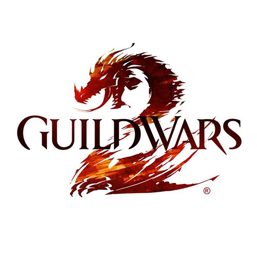
This game’s logo is like an aggressive version of the Final Fantasy logos.
Eschewing the typical medieval-esque lettering from the previous game, the sequel incorporates a chopped-up serif typeface. The main highlight, of course, is the highly stylized dragon that forms the letter ‘2’.
Bonus points for cleverly making the transition between the critter and the number seamless.
Check back next week for part 4!


0 comments:
Post a Comment