


Continuing on with Part 4 of our Top video game logos Gaming Thoughts series, here are the next ten entries from Hamza right after a short re-introduction of what this list contains.
Estimated reading time: 8 minutes
One thing I believe I should clear before commencing: the title of this list is very vague. Now, a logo by definition is a graphic icon used to identify something, anything, whatever. It is usually the first visual identity you notice of a brand, business, or organization, and the basic types range from symbol, word mark, letter mark, emblem, or any interesting combination of the four.
For the sake of removing a layer of stress from my mind, I decided to take all logo types into account - so expect iconic typography, abstract symbols, aesthetically pleasing pictograms, and the like. This list covers only the logos that represent either a single video game or an entire franchise at large (ex: Grand Theft Auto and Final Fantasy), though there's no "one-game-per-franchise" rule here. Often long running franchises implement tweaks here and there to accommodate with the times and as such, variations have also been taken into account.
So without further ado, here's the next part of the list:
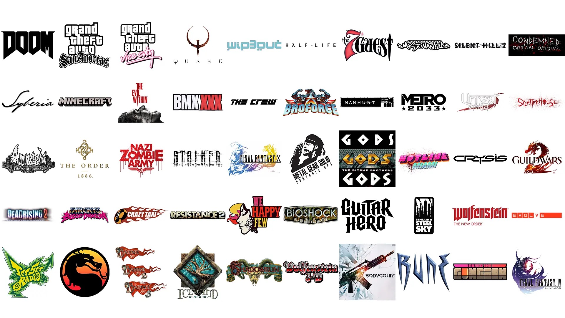
31. Dead Rising 2
Very few logos include scanlines in their logos.

Dead Rising 2 is one of those very few.
Being the ‘scanline’ junkie that I am, there’s something about this aesthetic that I adore. It’s also clever: media and the news play a major role in the game.
32. Far Cry 3: Blood Dragon
Designed by one of my all-time favorite visual artists, James White (of Signalnoise fame), the logo – and indeed, the entire cover – is a splendid pastiche of the neon-flavored side of the 80’s.’

No surprise, given the fact that the artist significantly helped popularize the essence of the synthwave scene; from which the game borrows and pays heavy tribute to.
For the Blood Dragon title, he used his custom font Neo-Noire.

Mr. White would also go on to create the identity for the spin-off game, Trials of the Blood Dragon. I highly recommend checking his website for all behind-the-scenes and alternate ideas sketches. They are wild!
33. Crazy Taxi
Instantly iconic.

You’ll be very hard-pressed to find someone who truly doesn’t know what game the crazy ‘C‘ belongs to. To put this in perspective: my dad, whose only contact with the video gaming world has been through a digital version of Sudoku, can easily name the game.
To be fair, he does refer to it as “that crazy driving game“, but hey it’s close.
Also: tribal flames. If there’s one thing I truly enjoy drawing on paper, it’s tribal flames. They’re just insanely fun and cathartic to draw.
34. Resistance 2
The Resistance series has had pretty solid graphic design in all instalments. The mutant skull with the landscape substituting for its teeth is a pretty iconic image for the series. The typography – which is the main focus here – has also been very solid from the get go.

Until the series was given a minimalist overhaul by Olly Moss, the game employed blocky letters that at-once feel militaristic, appropriate given the game’s theme.
35. We Happy Few
Maybe it’s because I’ve seen The Prisoner a hundred times, but the second I saw the We Happy Few logo (minus the mask graphic), I instantly knew this would be a 60’s inspired title set in some sort of a dystopian world.

I haven’t played the game yet, but my observation was rather spot on. That’s the mark – and indeed the overall point – of good graphic design.
36. Bioshock
This game’s logo looks just as cool animated as it does in static form. Even if you don’t know much about the game, the Art Deco font hints at something retro and the rusty, corroded nature implies water plays a huge role.

37. Guitar Hero
The typography borrows heavily from the metal logos of the 70’s and 80’s, namely Metallica, AC/DC, Iron Maiden, and Pentagram.

This entry is a particularly tricky one as I love both the original logo and the revamp by Pentagram (the OTHER one). The composition is clean and the exaggerated curves and tails of the letters give off a very energetic, kinetic look.

Pentagram took the existing template and, well, shaved off the extra flair to give it a slightly more inclusive look, to reflect the wide variety of music beyond just heavy metal – which to me works just as well.
38. Beneath a Steel Sky
I simply love everything about this game: the poetic title, fantastic artwork by Dave Gibbons (of Watchmen fame), catchy soundtrack… this awesome logo. Stark black and white, the typography seems to play out the game’s title while the factory silhouette alludes to the ‘steel sky’.

39. Wolfenstein: The New Order
The Wolfenstein series was the last place I expected to carry good graphic design – but boy do they pull it off nicely in The New Order. The marketing for the game contained strong use of red, white, and black, with extremely clean typefaces. The loading screens use a blackletter typeface while an ultra clean font is used to convey the current year in-game.

New Order uses an even more simplified version of the 2009 Wolfenstein logo (which itself was a simplified variant of Return to Castle Wolfenstein). The cleanness of the letters mean any combo of the aforementioned colors work brilliantly.
40. Evolve
At first glance, Evolve’s logo is simple and unassuming; but it’s rather clever in its simplicity. The game sees a group of 4 hunters up against a monster who continuously evolves. This should be enough to make you understand the design.

Check back next week for part 5!


0 comments:
Post a Comment